

Your Watch Doesn't Understand Trail Running Performance
VO2 max, lactate threshold and economy predict road performance well. On trail they barely correlate. Here's the physiology behind why, and what predicts trail performance instead.

If you’re looking for highlights rather than a deep dive, feel free to skip straight to the Key Takeaways throughout. If you want the nuance, the data, and the reasoning behind it, read on.
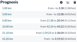
Regardless of the watch brand you use, it almost certainly has some kind of race prediction feature. Using metrics such as VO2 max, lactate threshold and training history amongst others, your watch attempts to estimate your performance over distances up to the marathon. The feature isn’t unique to watches either, as some training platforms offer some version of it, each with their own quirks. Even on the road, where the underlying models are best supported, these predictions tend to run slightly optimistic.
On trails, or even just on hills, they break down entirely. On my Garmin, the algorithm doesn’t even attempt to adjust. Build a half marathon course with no elevation, then build another with a substantial climb, and it will predict the same finishing time for both, as though the hill doesn’t exist, and that’s before accounting for the extra time lost to technical terrain. For most trail runners, that makes the feature close to useless.
Some platforms claim to have built trail-specific algorithms, but these tend to sit apart from any physiological metric or lab test altogether. Rather than modelling the physiology, they correlate your performance against similar runners, or extrapolate from your times over shorter distances.
This left me with two questions: why do the physiological metrics that work well on the road fall apart on trail, and is there a metric, or a test, that predicts trail performance better?
To answer that, I first need to explain the physiology behind the road-running prediction model, before turning to some new research which is looking to close the existing knowledge gaps.
The Classic Endurance Model
Much of how we understand and predict endurance performance, for any event from 5,000m to the marathon, traces back to a model published by Michael Joyner in 1991, with a widely cited follow-up in 2007 [1, 2].
Joyner wasn’t looking to build a performance model, but rather, he was looking to understand the theoretical fastest time a human could run a marathon. At the time, the world record stood at 2:06:50, a long way from today’s 1:59:30, and the question driving the paper was whether breaking two hours was physiologically possible at all.
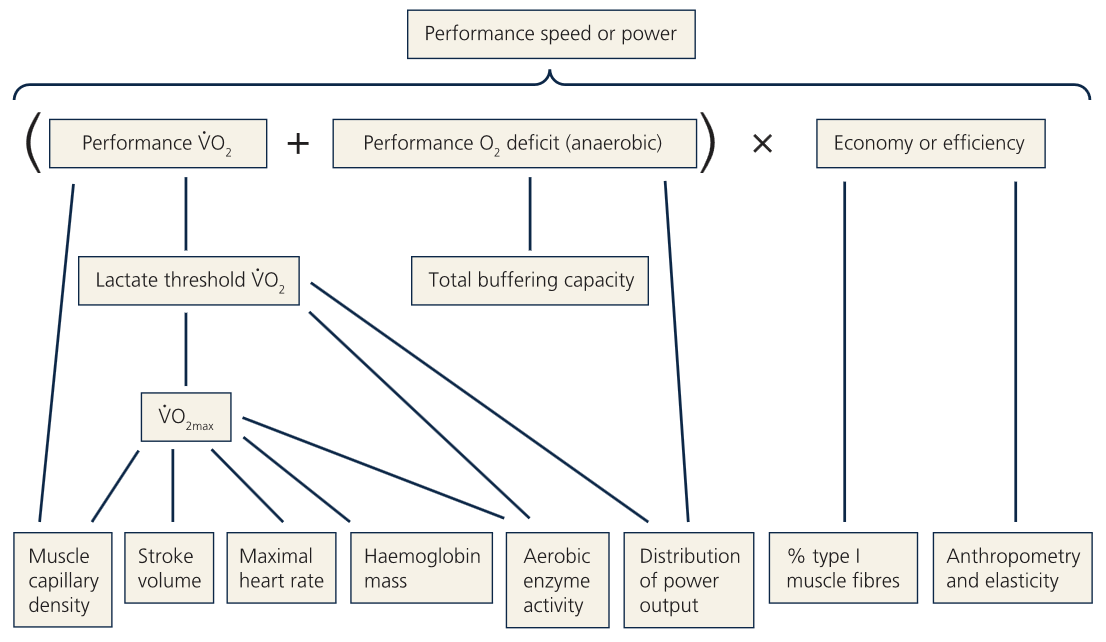
To answer it, Joyner broke performance down into three physiological variables:
Maximal oxygen uptake (VO2 max)
Blood lactate threshold
Running economy
It’s worth flagging that Joyner deliberately excluded anything outside pure physiology such as weather, tactics, nutrition and hydration. Those factors matter, but they weren’t the point of his model, and they’re not our starting point either.
The First Pillar: The Aerobic Ceiling
If you’ve read this far, I’ll assume you already know what VO2 max is, so I’ll keep this brief.
VO2 max is the ceiling on aerobic energy production, including the integrated capacity of your heart, blood, lungs and muscles to deliver and consume oxygen. Its key contributors are cardiac output (particularly stroke volume), total haemoglobin mass, muscle blood flow, and oxygen extraction at the muscle itself.
Joyner set the floor for a competitive professional marathoner at 70 ml/kg/min, a figure anchored to Frank Shorter, a leading marathoner in the 1970s, whose VO2 max was reportedly 71.3. He considered 77 ml/kg/min average, and 84 ml/kg/min high.
But athletes can’t hold VO2 max for races longer than 10 to 15 minutes, so on its own, VO2 max doesn’t explain marathon performance.
The Second Pillar: Fractional Utilisation
Once it’s established that races aren’t run at VO2 max, the obvious next question is what fraction of it can you sustain, and for how long?
Put simply, lactate threshold is the intensity at which your body produces lactate faster than it can clear it. As intensity rises, your muscles lean more heavily on energy pathways that produce hydrogen ions, lowering blood pH and creating that familiar burning sensation. Contrary to popular belief, lactate itself isn’t the cause of that acidity; it’s actually a fuel source and a buffer your body uses to manage it. The main determinant of a high lactate threshold is skeletal muscle oxidative capacity, essentially the density and activity of mitochondria in working muscle, which is highly trainable, as mitochondrial capacity can more than double with sustained endurance training.
Racing above this threshold is costly, since the waste products generated interfere with oxygen uptake and fat utilisation, eating into your endurance reserves. A good endurance athlete can therefore sustain a high percentage of VO2 max without crossing into unsustainable territory (hence the term fractional utilisation). Sedentary individuals typically sit around 60% of VO2 max; Joyner classed 85%+ as a high threshold, 80% as average, and 75% as low.
Side Note: Your muscles are not sore because “they contain too much lactic acid”. Lactic acid doesn’t exist. For a deep dive on lactate, you should read this fantastic piece by Dr. Inigo San Millan [3].
The Third Pillar: The Oxygen Cost of Running
Running economy goes a step further than lactate threshold. Where lactate threshold defines what percentage of VO2 max you can sustain before tipping into the anaerobic system, running economy measures the oxygen cost of running itself.
That cost can differ by 30-40% between individuals, meaning two runners with identical VO2 max and lactate threshold could produce very different performances, simply because one uses far less oxygen to hold the same pace.
Running economy also happens to be poorly understood. Unlike cycling, running involves significant stretch-shortening cycles and elastic energy storage, and biomechanical measurements have consistently failed to explain why some runners are simply more efficient than others at the same pace. Given that gap in understanding, the field has largely settled for a proxy formula, VO2 × 0.2936 + 2.6481, derived from a study of just twelve athletes, to classify good running economy.
Key Takeaway 1: Your physiological performance is dictated through a mix of your VO2 max, lactate threshold and running economy.
The Theoretical Fastest Marathon
To close this part of the story, here's the formula Joyner arrived at, and the "perfect" marathon time it produces:
Performance velocity = VO2 max × lactate threshold (% of VO2 max) × running economy
Plugging in his upper-bound figures gives a theoretical best marathon of just under 1:58. That number comes with caveats, as weather, tactics, technology (super shoes weren't a factor in 1991) and individual physiology can all shift it. The most interesting limitation, to me, is what Joyner calls the mutual exclusivity of exceptional values. This means that an athlete with an exceptional VO2 max may simply be physiologically incapable of also having an exceptional lactate threshold, thus making this best marathon time impossible to achieve using physiology alone.
Which Pillar Matters Most?
Once the three pillars are established, the natural next question is how much each one actually contributes to performance. Several studies have tried to answer this, but a 2026 study stood out to me for its scale; 888 participants, split between 495 runners (105 female, average VO2 max 56 mL/kg/min) and 393 cyclists (42 female, average VO2 max 52 mL/kg/min) [4].
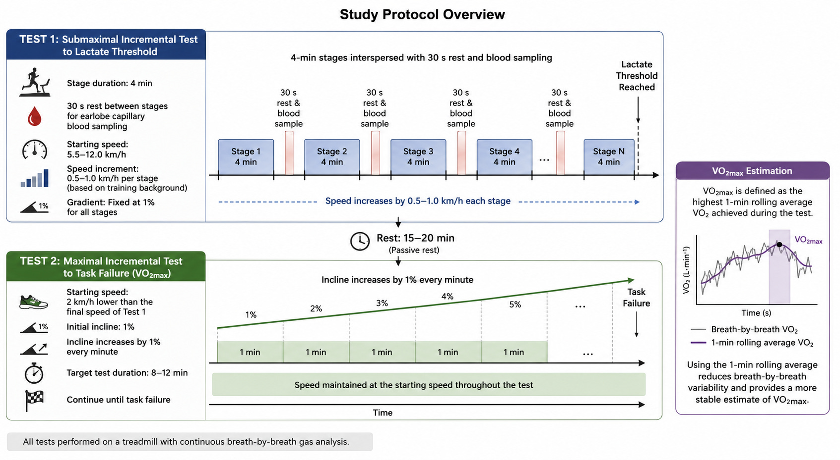
Runners completed an incremental treadmill test in 4-minute stages, with capillary blood sampled between stages until they hit their second lactate turn point, followed by a separate maximal test to establish VO2 max. Cyclists followed an equivalent protocol on a bike, with power output substituted for pace and gradient.
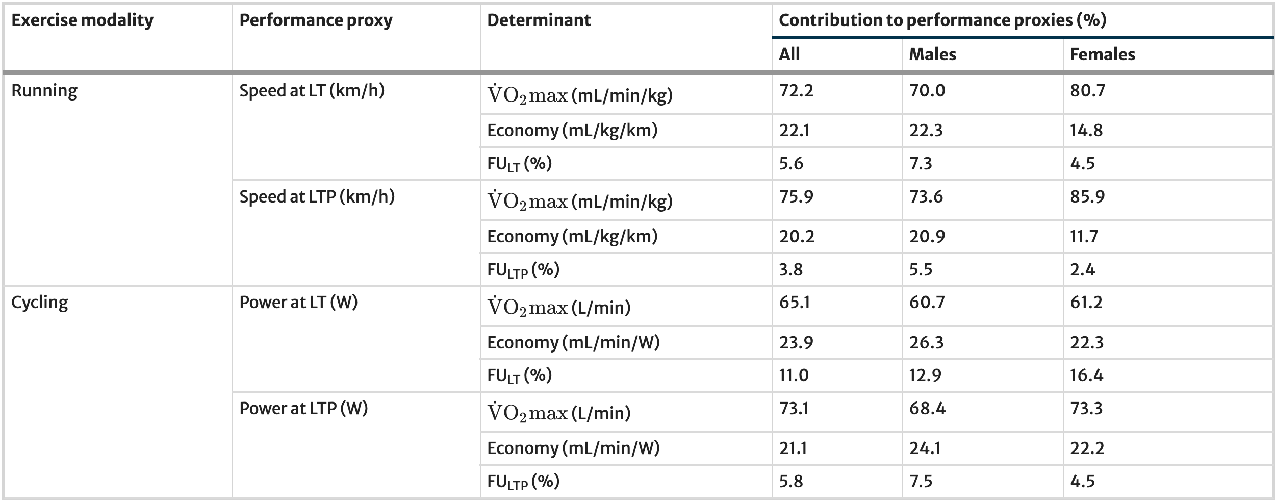
VO2 max dominated. In running, it explained 72.2% of an athlete’s speed at their first lactate turn point, and 75.9% at their second. Running economy followed at 20-22%, with lactate threshold, expressed as the percentage of VO2 max at which it occurs, contributing only 3.8-5.6%. Cycling showed a similar pattern, with VO2 max contributing slightly less in favour of lactate threshold.
The reason lactate threshold barely registers here is largely statistical. Across a mixed-ability cohort, VO2 max and running economy simply swamp its contribution. A recreational athlete’s lactate threshold can look like a high percentage of VO2 max purely because their VO2 max is modest, so the threshold occurs at a relatively high fraction of a low ceiling. It only starts to matter again once you compare athletes with similar VO2 max, which is probably why Frank Shorter and Steve Prefontaine ran near-identical 5km and 10km times despite a roughly 13 mL/kg/min gap in VO2 max (71.3 vs 84.4).
Key Takeaway 2: VO2 max explains roughly three-quarters of performance differences across amateur mixed-ability athletes, but lactate threshold starts to matter once you’re comparing athletes with similar VO2 max.
Applying the Model to Trail
I’ve gone through the Joyner model in this much detail because, without any inside knowledge of proprietary algorithms, I suspect it’s what most race predictors are built on. Your watch can estimate your VO2 max, it has a rough read on your lactate threshold from your training zones, and can estimate your economy from your long runs. Feed those three numbers through some proprietary algorithm, and pair it with the data collected from your training runs, and out comes a race prediction.
The problem is that trail running is physiologically distinct from road running. By definition, it takes place on unpaved surfaces with regular, often steep, ascents and descents, over distances ranging from a few kilometres to hundreds. As De Waal et al. note, that alone may demand different physiological and mechanical outputs to road running [5]. Yet the road running model is still what gets applied to trail runners, which is exactly what led De Waal’s team to conduct a systematic review testing how well Joyner’s three variables actually predict trail performance.
Across the studies that met their inclusion criteria, seven in total covering 129 participants (10 women), the strongest predictor of trail performance was velocity at VO2 max, with a correlation of -0.68. Body fat percentage followed at 0.55, age at 0.52, VO2 max itself at -0.50, lactate threshold at -0.48, and running economy, trailing the pack, at -0.31.
For context, these correlations are considerably weaker than what’s typically seen on the road, where sub-marathon distances show an average correlation closer to -0.8. Running economy’s poor showing is particularly interesting given that trail and ultra events are run at a very low intensity where running economy is expected to matter the most.
Key Takeaway 3: The classic three-pillar model predicts trail performance far more weakly than it predicts road performance, and running economy is the weakest predictor of the three.
Why the Classic Model Falls Apart on Trail
Three explanations stood out among those the authors proposed. First, trail performance depends on a wider set of factors than road performance does. Pain tolerance, prior experience, training history, pacing strategy, nutrition and individual pain threshold all play a bigger role as the race duration increases. These exist in marathon running too, but they carry more weight on trail, and none of them show up in a lab test built around VO2 max and lactate threshold.
Second, testing trail runners on flat, road-style protocols violates the principle of specificity. Trail runners perform noticeably better on inclined, trail-specific VO2 max protocols than on standard flat ramp tests, because their training has produced adaptations specific to uphill running that a flat test doesn’t capture.
Third, trail races are too varied as a category to behave like a single performance variable. Fatigue mechanisms, metabolic demands and limiters differ enormously between a 20km mountain race and a 100 mile ultra. One study in the review found VO2 max and lactate threshold correlated with performance over 69km, but not over 121km (75 mile), suggesting distance alone is a meaningful confound.
That specificity problem, the second point above, is what De Waal’s team decided to chase next. If flat testing lacks specificity, does testing on an incline actually capture what determines trail performance?
Key Takeaway 4: Testing trail runners on flat protocols breaks the principle of specificity.
A Trail-Specific Alternative
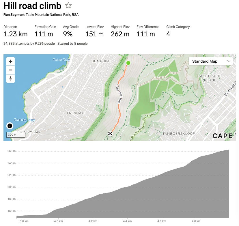
De Waal et al.’s next step was to look for evidence in the field, using Strava data from the 2021 Ultra Trail Cape Town [6]. Fifty male finishers’ data were analysed, comparing 6 of the top 10 against the rest, across 46 pre-defined segments covering 69.2km (43 miles) of the 100km (62 miles) course. Segments were classified as uphill (net gradient over 1%, no negative gradients within), level (between -1% and 1%), or downhill (below -1%, no positive gradients within), with further breakdowns for moderate and steep gradients in each direction.
To compare runners fairly, each segment’s pace was normalised to the runner’s own average race pace. A runner averaging 10:00 min/km (16:06 min/mile) who slows to 15:00 min/km (24:08 min/mile) on a given climb has a relative pace of 150%, regardless of how fast they are overall. That normalisation is what let the authors ask which terrain type, relative to a runner’s own pace, best predicted their overall finishing time.
Of the 69.2km (43 miles) analysed, uphill and downhill terrain together made up roughly 80% (just under 30km/18.6 miles uphill, just under 25km/15.5 miles downhill), with the rest level. Runners moved slowest on the climbs (13:41 min/km, 22:01 min/mile on average), fastest on the flats (8:53 min/km, 14:18 min/mile), and, notably, slower on descents (10:23 min/km, 16:43 min/mile) than on level ground, reflecting the technical and neuromuscular demands of steep downhill running.
Uphill pace produced by far the strongest correlation with finishing time, at 0.826, with moderate and steep uphill segments individually still strong at 0.776 and 0.733. Level running was only moderately correlated (0.402), and downhill weaker still, and in the opposite direction (-0.381). Better runners also handled descents better, but nowhere near as decisively as they handled climbs. The authors put this down to two compounding factors: climbs made up a larger share of the analysed distance, and because runners move more slowly uphill, they spent disproportionately more total race time there, roughly six and a quarter hours climbing versus three and a half descending.
That finding gave De Waal’s team a working hypothesis. If uphill pace predicts race performance this well, an uphill-based treadmill test might predict it far better than the flat, road-style protocols already shown to fall short. But before that test could be useful, two things needed establishing:
Is an uphill sub-maximal test reliable? Does it give you the same numbers on a good day as a bad one? If it’s noisy, you can’t tell a real change in fitness from measurement error.
Does flat running economy actually predict uphill running economy well enough that you could infer one from the other, or are they physiologically distinct enough to need separate testing?
Testing the Test
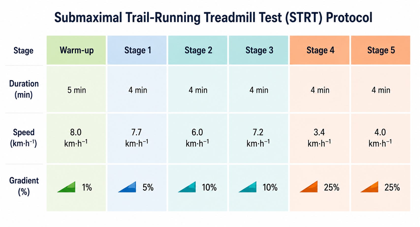
Twenty-three recreational and experienced male ultra-trail runners (average VO2 max 59.7 mL/kg/min, eight years of running experience, 72km/44.7 miles and 2,200m/7218 ft of climbing per week) were tested across three lab visits over three weeks, spaced seven days apart to allow recovery without any real change in fitness between sessions [7]. The first two visits repeated a trail-specific VO2 max test and an uphill sub-maximal treadmill test, while the third used a standard flat treadmill economy protocol for comparison. The uphill protocol combined gradients of 5%, 10% and 25% with varying speeds, producing efforts equivalent to 61-74% of VO2 max and 81-86% of maximum heart rate.
Heart rate was the standout for reliability, with correlations of 0.86-0.96 between visits and typical error of just 1.9-3.6%. This means that if a runner’s heart rate shifts by more than around 3% between tests, that’s a real change, not noise. Oxygen uptake and running economy were also reliable, if slightly less so (correlations 0.57-0.89, typical error 2.7-5.4%), broadly in line with what’s been reported for flat testing, though this was the first time it had been established for an uphill protocol.
Perceived exertion (RPE) was the weakest, with correlations of just 0.55-0.70 and typical error, ranging from 6.6% to 13.3%. The authors mention that RPE is a single number standing in for two distinct sensations, locomotor effort in the legs and respiratory effort in the chest, processed through separate neural pathways. On a test that constantly shifts both speed and gradient, separating those two signals gets difficult. One participant, mid-test, asked the researchers whether he should provide an exertion value “in my legs or my chest?”, which sums up the problem better than any statistic could.
Generally, reliability also dropped off at the steepest gradient, largely down to gait. At 25%, treadmill speeds fell to 3.4-4.0 km/h, slow enough to sit right at many runners’ walk-to-run transition. On the first visit, 91% of participants walked the fourth stage and 74% walked the fifth. On the second visit, participants were told to repeat whatever gait they’d ended on, but the mismatch between the two visits introduced its own variability, since walking and running at the same speed are metabolically distinct in stride mechanics, muscle recruitment and ground contact time. The authors recommend a familiarisation session and a standardised gait protocol for future testing.
Key Takeaway 5: Heart rate is highly reliable on an uphill treadmill test; perceived exertion isn't, because it conflates two distinct sensations (leg effort and breathing effort) that get harder to separate as speed and gradient both shift.
Two Tests, Two Different Answers
The second question, whether flat and uphill running economy are closely related, produced a more surprising answer. Although the authors hypothesised that these two values would be closely related, their research showed that they are not, and that the relationship gets weaker the steeper the gradient. At 5%, the correlation between flat and uphill economy was strong (0.71-0.81); by 10% it had dropped to moderate (0.45-0.73, depending on speed); by 25%, it had essentially disappeared (0.3 at both speeds tested).
The explanation lies in how running economy and heart rate each respond to gradient. Economy worsens sharply and non-linearly as gradient increases: 1.3x the flat cost at 5%, 1.7x at 10%, 2.8x at 25%. That’s because steep uphill running isn’t just a harder version of flat running. It recruits different muscles, uses different mechanics, and can’t rely on the elastic energy return that makes flat running efficient. Heart rate, by contrast, rose only modestly and consistently, around 1.1x flat values across every gradient, and stayed moderately-to-strongly correlated with flat heart rate throughout (0.69-0.89).
The authors attribute this to locomotor-respiratory coupling and what they consider a self-optimisation. As gradient increases, runners reduce their stride frequency, which lowers metabolic cost and allows deeper, more efficient breathing. That keeps cardiovascular load relatively stable even as the mechanical cost of climbing compounds, effectively buffering the heart from the gradient in a way that running economy isn’t. Interestingly, at 25%, runners who kept running rather than switching to a walk, typically the fitter ones, actually posted worse economy than those who walked. Although counterintuitive, at very slow speeds on very steep inclines, walking is simply the more efficient gait, and the fittest runners were the ones paying the price for staying on their feet.
Taken together, the research findings by De Waal et al. represent an improvement compared to what we knew already, but it still doesn’t fully explain what separated the top 10 finishers at UTCT from the rest of the field, and the same race data points to something the Joyner model has no room for at all.
Key Takeaway 6: Flat running economy stops predicting uphill running economy above roughly 10% gradient, so a flat lab test can't stand in for a trail-specific one.
The Missing Fourth Pillar
Beyond terrain, De Waal’s UTCT analysis also compared how the top 10 finishers and the rest of the field distributed their effort across the race [6]. The gap in absolute terms was substantial, as the analysed top 10 runners averaged a finishing time of 10 hours 48 minutes (6:37 min/km, 10:40 min/mile), while non-top-10 runners averaged a finishing time of 18 hours 18 minutes (11:12 min/km, 18 min/mile). But the more interesting question wasn’t the size of that gap, it was its distribution.
Looking at relative pace, each runner’s pace on a segment as a percentage of their own average, 26 of the 46 segments showed a statistically significant difference between the two groups. Of those, the non-top-10 runners ran the relatively faster pace in 18, nearly 70% of cases, and this wasn’t scattered randomly through the race. Splitting the course into quarters, every single significant difference in the first half showed the non-top-10 group pushing harder relative to their own capacity, and in the third quarter, it was 80%.
Then, in the final quarter, the pattern reversed almost completely, as only 12.5% of significant differences now favoured the non-top-10 group, and the gap that opened up was concentrated on the downhills, where six of the eight late-race segments showing a significant difference were descents. The runners who’d held something back were now able to use them, while runners who hadn’t were struggling to hold pace on terrain that rewards freshness.
Both groups slowed as the race wore on, but the non-top-10 field front-loaded their effort and paid for it late, while the top 10 spread their effort more evenly and arrived at the final quarter with something left for the descents. The authors attribute this to some combination of a better-tuned pacing strategy (an internal model of total race demand, sometimes called teleoanticipation) and simply being better physiologically adapted to the specific demands of trail terrain, so the climbs cost them less to begin with. Most likely, it’s both.
Naming the Pattern: Physiological Resilience
This pacing divergence is a real-world echo of a concept formalised in a 2023 paper by Andrew M. Jones [8]. Jones argues that endurance performance isn’t fully explained by Joyner’s three “start line” pillars, because none of them are fixed. VO2 max, running economy and lactate threshold all deteriorate over the course of a race, and they do so unevenly between individuals. He calls resistance to that deterioration physiological resilience, or durability, and argues it belongs in the model as a fourth dimension.
The evidence that pushed him there starts with a mismatch. When Jones updates Joyner’s model using real data from Nike’s Breaking2 project, lower VO2 max but better fractional utilisation (92%) and economy than Joyner assumed, it predicts an implausible 1:55:05, well under Kipchoge’s actual 1:59:40. That overshoot is the tell that the classical model is missing a variable.
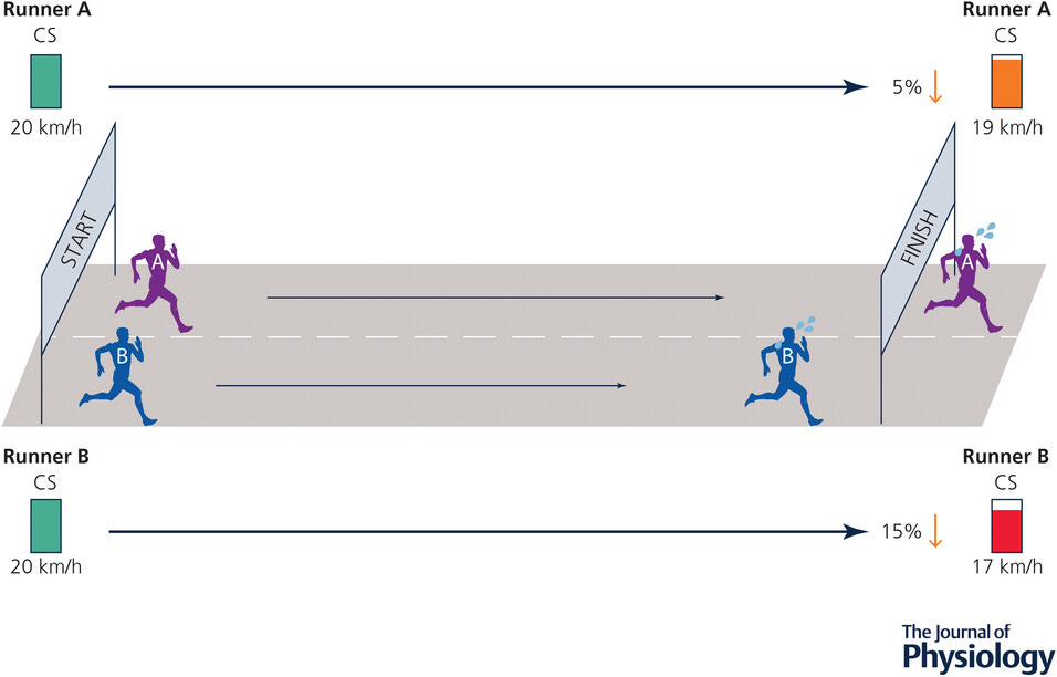
To fill that gap, Jones brings in critical speed (CS, or critical power, CP, in cycling). Critical speed is the fastest pace you can hold in a steady state before rapidly burning through a limited reserve, and he argues it’s a cleaner way to think about sustainable race pace than lactate threshold. The strongest evidence comes from studies testing cyclists’ maximal short-effort power before and after two hours of hard riding. On average, that ceiling dropped 8-11% post-ride, but individual riders varied hugely, from barely any drop to over 30%, and starting fitness didn’t predict who faded. What mattered was how hard, relative to their own limits, they’d worked during those two hours. Carbohydrate intake mattered too, as riders who fuelled during the ride barely lost any power ceiling, while those on a placebo faded considerably more, likely tied to glycogen depletion.
Real-world data backs this up. In marathon runners, cardiac drift (heart rate creeping up relative to pace in the later stages) typically starts around the two-thirds mark. Across more than 82,000 recreational marathoners, those whose heart rate and pace stayed better matched throughout finished faster, even after accounting for starting fitness. In professional cycling, top riders hold onto peak power output deep into a race, while less experienced riders fade noticeably, despite both groups posting similar numbers when fresh.
Jones concludes that standard incremental lab testing, done in a fresh state, is fundamentally incomplete, since races are mostly run while fatigued. He suggests measuring sub-maximal energy cost before and after a fatiguing protocol, or using field-based decoupling metrics from training platforms, as more practical ways to capture resilience. His revised model places resilience not as a fourth box alongside the original three, but as a moderating term acting on all of them.
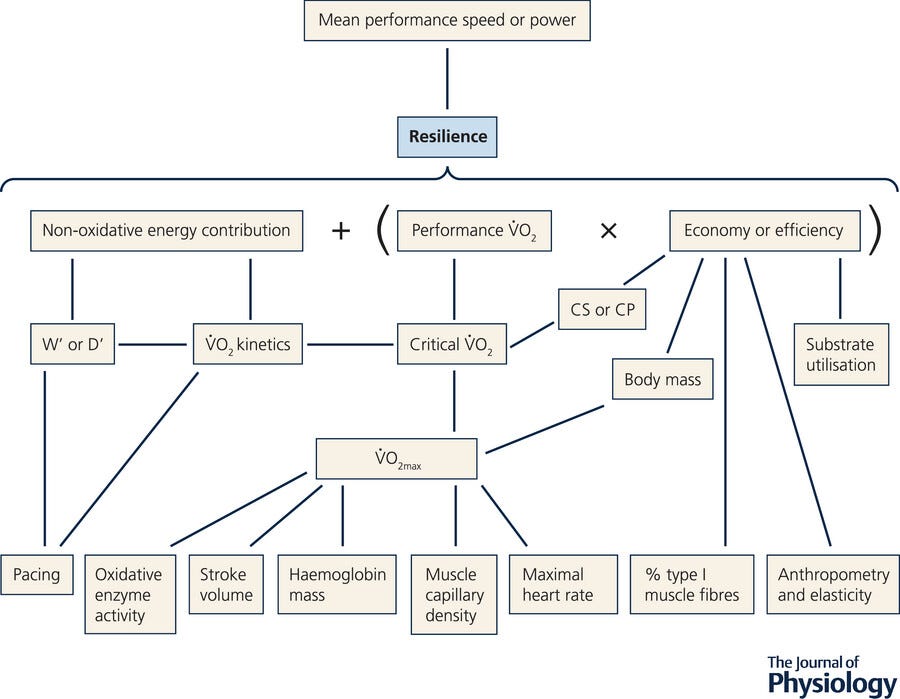
Key Takeaway 7: Physiological resilience (how little your VO2 max, threshold and economy degrade under fatigue) may be a fourth pillar of endurance performance the classical model never accounted for.
What This Means for Your Training
Trail and ultra running has too many moving parts to reduce to a single formula, and this article has only covered the physiological side of it, before nutrition, hydration, heat and altitude even enter the conversation. Technology has tried to close that gap, and for now, it hasn’t.
Which brings us back to the watch. The reason it can’t tell the difference between a flat half marathon and a hilly one isn’t a software oversight. It’s that the underlying model, VO2 max, lactate threshold and running economy measured on the flat, was never built with hills in mind, and the research above suggests it may never fully capture them, even with an uphill-specific test. What that research does give is a clearer map of what to actually train.
VO2 max, lactate threshold (or critical speed), running economy, and physiological resilience are the four levers that actually move performance, even on the trail. Train each of them deliberately across a season, with the most specific work sitting closest to race day, and you will improve regardless of whether any watch or lab test can quantify it.
Next week, I’m releasing a podcast episode with Dr. Simon De Waal, the researcher behind several of the studies discussed here, on the topic of quantifying trail performance.
Simon is a Senior Lecturer in Sport and Exercise at the University of Gloucestershire and a sports scientist specialising in trail and ultra-running performance. He earned his PhD from Stellenbosch University, where he focused on the physiological and biomechanical demands of ultra trail running. His research bridges the gap between laboratory testing and real-world performance, exploring how trail running differs from traditional road marathons.
The episode will be available here on Substack, as well as on YouTube, Spotify, Apple Podcasts and YouTube Music.
Most runners don’t need more information - they need a thinking partner.
If you understand the theory here but are struggling to translate it into a plan that fits around work and family life, coaching can help bridge that gap. I work with athletes to make sense of where they are, identify what actually matters, and move forward with clarity and confidence.
Learn more at the link below:
Coaching

Most trail and ultra runners don’t need someone telling them exactly what to do, they need clarity through discussion. They need space to talk through doubt, plateaus, conflicting advice, messy data and the persistent question of “am I actually doing this right